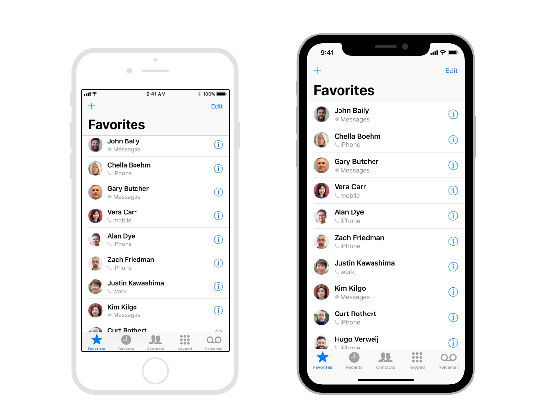
Designing for this beautiful machine will bring some new challenges, but also some new design opportunities. The width of the device in portrait mode is the same as the iPhone 6, 7 and 8, but is 145pt taller, which results in ± 20% more vertical space. When designing @ 1x you need an artboard of 375×812px. You won’t export images @ 2x like the iPhone 8, but @ 3x like the iPhone 7-8 Plus, because of the new Retina display.
When creating your design, you must make sure you don’t obscure your UI with the devices unique features (the round edges, the cut-out at the top and the home indicator). By the way, the home indicator is that small line that lives on the bottom of your screen, it replaces the physical home button. You swipe up from any app to go back to your homescreen or into multitasking.
If you currently have an app that uses iOS native component you will be fine and your app will already be adapted for this new iPhone. This can be navigation bars, tables, collection views and tab bars. They will be automatically inset and positioned.
If you use custom layout, your app might need to be updated to the new screen layout. If you use Auto Layout however, that might be fairly easy.
Let’s get started
First off, embrace the devices design, Apple employees didn’t work this hard for you to hide the wonderful features of this expensive piece of hardware.
Make sure you create a full screen experience. Let scroll views scroll to the very bottom of the screen even beyond the edges of the curved bottom of the display. Apple also kindly asks you not to hide the cut-out at the top and the curved edges at the bottom, so don’t go placing black bars to make it look like a regular old school iPhone 8.
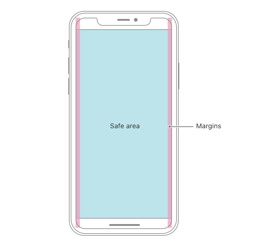
Center and inset important information. Make sure that important content is aligned in the center and use symmetrical insets, so your UI doesn’t get clipped by the device’s sensors or corners. If you use Auto Layout, your content will automatically be placed within a safe area so your design won’t be hidden behind the corners, sensors or the home indicator.
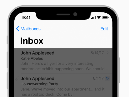
The new status bar. Because of the sensors on top of the display, the new status bar is split in 2 parts. If your UI is doing something special with that space (previously 20pt high, now 44pt), you will need to update your interface because it will be taller on the iPhone X. Make sure that it can be dynamically changed in height. A great thing is that the height won’t be changed if a user makes a phone call or is using a navigation app, which was previously the case on other iPhones.

Show off the new status bar. If you currently hide the statusbar in your design, Apple asks you to reconsider this decision. Since the screen is taller and you have more estate to display your content it might be use full to unhide that status bar. Users can find useful information up there and the space will most of the time not be used by other UI elements.
Full screen images. If you are currently using full screen images in your design, you will need to update them for the new iPhone. They might be cropped and an essential part of the visual might be hidden.
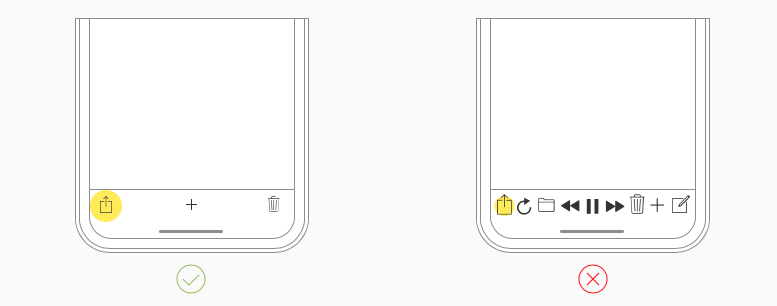
Don’t place interactive controls at the bottom of the screen. The spacing around the home indicator is purely created for gestures, swipe up to go home. Placing buttons near this indicator or in the bottom round corners of the display might not be great. Users might accidentally use the home gesture and your UI will be difficult to reach. You can however still use tab bars and function bars, but keep in mind that they should not interfere with the home indicator.
Don’t hide the home indicator (all the time). iOS makes it possible to hide the home indicator in your app, this will auto-hide it when the user doesn’t touch the screen for a few seconds. It will reappear when the user touches the screen again, this should be mainly used for immersive experiences like viewing videos or photos. The home indicator will also change color automatically based on the background of your app.
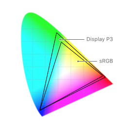
More colors. The new Super Retina Display displays more colors, P3 color instead of sRGB. This means that it will show richer and more saturates colors. Especially video and photos will benefit of this wider color range.
Swipe up, be mindful with the use of gestures. Since the physical home button is gone, you interact with your iPhone (more than ever) by using gestures. When you swipe up you go home or go to the multitasking view. When swiping left and right on the home indicator, you switch between your open multitasking apps. By swiping down from the top of the screen, you go to your Notification or Control Center. More so in games, you can use custom gestures that may override the native iOS gestures. You can use your own gestures by implementing “edge protect” which is a feature the will prefer the app’s specific gesture first, before the OS gesture, only one time though. Use this sparingly, because it will make it harder for your user to use system features.
Face ID. Previous iPhone has a great feature Touch ID, which allowed users to unlock their device or perform password locked actions inside apps by using their fingerprint. This sensor was hidden inside of the home button, since it has gone in the iPhone X, Apple replaced it with a more advanced and secure way of unlocking your device. Enter Face ID, it uses some really great algorithms to detect your face and unlock your device. This will show some new UI in apps, make sure you implement it for your (rich) users that have an iPhone X. Also make sure that you don’t reference to Touch ID anymore in your onboarding or menu, replace it with Face ID.
Custom keyboards. When you are designing a custom keyboard, you shouldn’t add an Emoji or dictation button to your keyboard. Because it will automatically be added underneath the keyboard around the home indicator.
Larger navigation bars. With iOS 11 the design of the native navigation bars got an update, they are now way taller. This design will especially be great on the taller iPhone X and will blend nicely with that new status bar. So consider using it in your design. These will also have some nice native animations when scrolling.
TL;DR
- The iPhone X is 145pt taller, so design for 375×812pt instead of 375x667pt
- The iPhone X uses @ 3x assets.
- Create a fullscreen experience, don’t hide the devices unique features.
- Center the importent content of your UI, to make sure it’s always visible and not hidden by the device’s sensors or corners.
- A new taller split-in-two statusbar, previously 22pt, now 44pt high.
- Fullscreen images might/should be updated to be fully displayed.
- Don’t add buttons at the bottom of the screen, near the home indicator.
- Don’t hide the home indicator, only when really necessary.
- Richer and more saturated colors thanks to the P3 color spectrum.
- Be aware for custom gestures near the home indicator and status bar, don’t mess with the user’s expected native gestures.
- Face ID replaces Touch ID, update your UI and replace textual references to Touch ID.
- Custom keyboards don’t need to add the Emoji and dictation buttons.
- Larger navigation bars will look and animate great on this tall display.



Comments
Post a Comment